Interactive Data Visualization with R Shiny for Life Sciences
Assignment: Milestones
Michael Teske & Jonas Schmid, Zurich 11 April 2024Assignment Overview
- Complete 3+ additional Milestones
- Deadline: Monday, 22 April 2024, 23:59 CET
-
Submit your work via Slack → see next page

- You may start from the Solution of Day 2 (if you feel like it)
- Choose from given suggestions (for individualists: or complete an equivalent work)
- Group work is possible
Assignment Submission
- Submit your assignment in the #assignment Slack channel
- Adhere to the following format:
- Screenshot
- Short Description (used data, kinds of plots, functionality of the app)
- If deployed online: link to the app
- If groupwork: who contributed what
- Code of the app (attach app.R file)
Evaluation
Please evaluate the Tutorial (if not done yet)
The link to the feedback form can be found on Slack
Milestones Overview
We suggest below milestones to choose from
On the following pages you will find hints on how to complete them
Deploy app online
Using shinyapps.io (free)
OR install shiny-server on a server that is remotely accessible and has port forwarding
- Very simple with shinyapps.io
- Detailed instructions on how to upload your app after login
- Put your app with all dependencies in a separate folder and deploy it using the rsconnect package
- Monthly limit for the app runtime with the free plan
- Suitable for most purposes
DataTable extensions
We can enhance our dataTableOutput with extensions,
check: https://rstudio.github.io/DT/extensions.html
To add a button for downloading displayed data in csv format (e.g. to open in MS Excel),
we can add the following code to the renderDataTable() function:
								extensions  = 'Buttons',
								options     = list(
									pageLength  = 10,
									scrollX     = T,
									pagingType  = 'simple_numbers',
									dom         = 'Bfrtip',
									buttons     = list(
										list(extend = 'csv', filename = 'selected_dots')
									)
								),
								rownames = F,
								server   = F # necessary to download whole table
Pay attention to the fact that some settings are provided inside the options list (!)
(note: the dom = 'Bfrtip' part is crucial)
Subset dataset
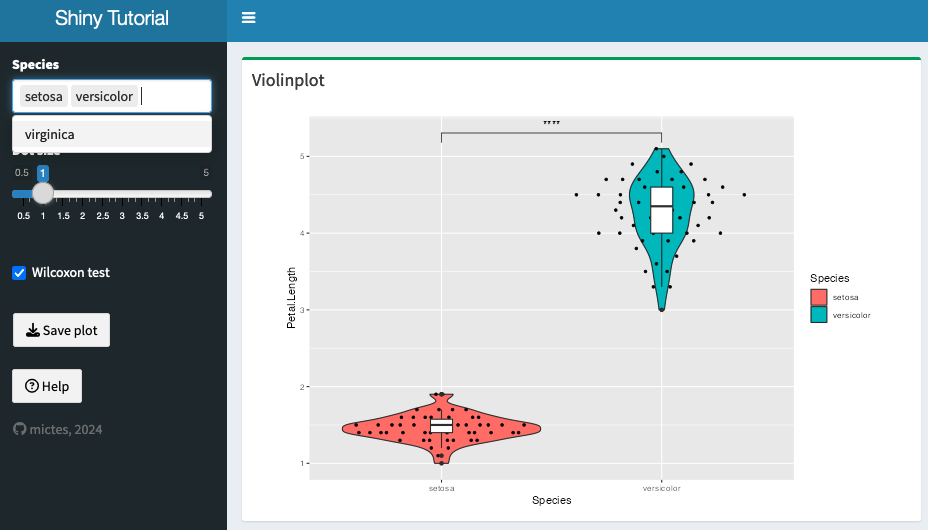
It can be a good idea to subset the dataset, to show only relevant information.
For example, using the iris dataset, we can select the species that we want to show.
One way to achieve this is via using reactive({}) together with selectInput:

									selectInput(
										'species',
										label     = 'Species',
										choices   = levels(iris$Species),
										selected  = levels(iris$Species),
										multiple  = T
									)
									# Subset iris data based on selected species
									data_subset <- reactive({
										req(input$species)
										iris_subset <- filter(iris, Species %in% input$species)
									})

									# Adjust ggplot to use the subset dataset
									violinplot  <- reactive({
										ggplot(data_subset(), aes(x=Species, y=Petal.Length)) +
											...
									})
shinyWidgets : Extend widgets available in shiny
We can get more widgets from the shinyWidgets package!
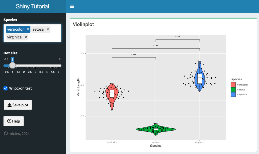
Let's improve the subsetting by allowing drag and drop ordering of the species, using selectizeInput
- or try to add another widget from the package

									library(shinyWidgets) # capital W
									...
									selectizeInput(
										inputId   = 'species',
										label     = 'Species',
										choices   = levels(iris$Species),
										selected  = levels(iris$Species),
										multiple  = T,
										options   = list(
											plugins   = list('remove_button', 'drag_drop')
										)
									)
									data_subset <- reactive({
									req(input$species)
										iris_subset         <- filter(iris, Species %in% input$species)
										# Adjust factor levels to make the plot honour our custom order
										iris_subset$Species <- factor(iris_subset$Species, levels=input$species)
										iris_subset         <- iris_subset[order(iris_subset$Species), ]
									})
Shiny Dashboard layout elements
Check the documentation of shinydashboard
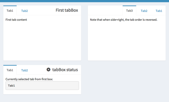
Add another element to your UI, e.g. a tabBox() (easy) or menuItem() (a bit more tricky)

Add a favicon
Favicons are small icons that a website can display in the tabs of your browser
We can add a favicon to our Shiny app like this:
								# Add this to tags$head()
								tags$link(rel='shortcut icon', href='favicon.png'),
Filepaths can be tricky, another way to include the favicon is by encoding it as a base64 image source
using small (!) images and a converter, like https://www.base64encoder.io/image-to-base64-converter/
								# Add this to tags$head()
								tags$link(rel='shortcut icon', href='data:image/png;base64,iVBORw0KGgoAAAANSUhEUgAAAQAAAAEACAYAAABccqhmAAA...'),
If you get an "unexpected symbol" error, try starting the app by pressing the "Run App" button in R Studio.
Interactive help function
By including the introjs JavaScript library, we can create an attractive help function!
								# Add this at the end inside dashboardBody()
								includeScript('https://cdn.jsdelivr.net/npm/intro.js@7.2.0/intro.min.js')
Using ID selectors, we can attach help texts to HTML elements in our Shiny App
The help texts are defined in JSON (JavaScript Object Notation) format, like this:
								tags$script("
									// create an array with objects describing each step in the guided tour
									var Steps = [
										{
											element:  '#species-label',
											intro:    'Select the iris species that you would like to include in the plot. You can drag and drop the items to display the species in the desired order.',
											position: 'right'
										},
										{
											element:  '#size-label',
											intro:    'You can adjust the size of the dots in the plot.',
											position: 'right'
										}
										...
									];
								")
Interactive help function
Now let's add an actionButton inside the dashboardSidebar()
								actionButton(
									inputId   = 'help',
									label     = 'Help',
									icon      = shiny::icon('question-circle')
								)
And extend our JavaScript to call the help function when clicking on the actionButton (check the id!)
								// Below JSON
								// initialize an introjs instance
								var intro = introJs();

								// load data
								intro.setOptions({steps: Steps});

								// start intro onclick on help button
								document.querySelector('#help').addEventListener('click', function(e) {
									intro.start();
								});
You can troubleshoot JavaScript errors using your browser's developer tools [F12] console
Plot statistics
In ggplot, we can add a statistics layer to a plot:
								... +
								stat_compare_means(
									comparisons = pairwise_comp( unique(data_subset()$Species)),
									method      = 'wilcox.test',
									label       = 'p.signif'
								)
Here we use the pairwise_comp function to create a list of comparisons between two neighbouring species
								pairwise_comp <- function(conditions) {
									conditions.clean  <- unique(as.character(conditions))
									comparisons <- combn(conditions.clean, 2, simplify=F)
									return(comparisons)
								}
Plot statistics
To enable dynamic toggling of the statistics layer,
add an input widget (e.g. checkboxInput()) and change the plot definition:
								# Instead of returning the plot directly, store it for later modification
								violinplot  <- reactive({
									pl  <- ggplot(data_subset(), aes(x=Species, y=Petal.Length)) +
										...

									if(input$statistics == T && !is.null(data_subset())) {
										pl  <- pl +
											stat_compare_means(
												...
											)
									}

									pl
								})
Password protection with shinyauthr
Explore the shinyauthr package and protect your app with a login.This is a slightly more complicated task. Make sure to have a look at this example.
(of note: if you have a server, you could also set up a reverse-proxy with nginx
and use .htpasswd basic authentication, but this is not a milestone!)
Questions & Feedback
→ Slack